Our color world feels differently in black and white. Key word: Feels.
![]()
This conversation was prompted by my seven-year-old son. He told me the other day that “too many of your photographs are in black and white, dad.” I didn’t know quite how to take that. Was this a generational difference? Would he later grow to acquire a love of black and white the way his father with good taste did? Or was it a sign of the times? Are we now an all color world only to be seen in color? Am I just showing my age? Am I slowly turning into a dinosaur or am I already there?
Perhaps the most overwhelming piece of practical evidence in favor of a yes would be that many of the greatest photographers who ever lived shot black and white almost exclusively. It’s difficult to ignore this. If you put together a photographic Mount Rushmore it’s possible that ALL of the finalists would be known for their black-and-white work. Names like Ansel Adams, Richard Avedon, Henri Cartier-Bresson, Diane Arbus, Edward Weston, Robert Frank, W. Eugene Smith, Helmut Newton, Mary Ellen Mark, Andre Kertez, and Elliott Erwitt come to mind. (And this is a cursory list at best.) If you study the history of photography it would be fairly easy to assume that visionary photographers prefer black and white.
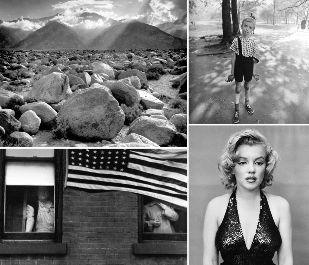
Four photographs from four of the greatest ever: Ansel Adams, Diane Arbus, Richard Avedon, and Robert Frank. (from top left clockwise)
![]()
Control. Trying to master the medium of color has always been a crapshoot at best. Even today color photography is loaded with intimidating variables. Did Ansel Adams shoot black and white because it was easier? Only the silliest of bloggers would use the words easy and Ansel Adams in the same sentence, but Adam’s love of the darkroom and the skill he demonstrated when he got in there allowed him to produce what the notoriously demanding Alfred Stieglitz said were the most beautiful photographs he’d ever seen. He could never have controlled color to the same degree; there are just too many unfriendly details to deal with.
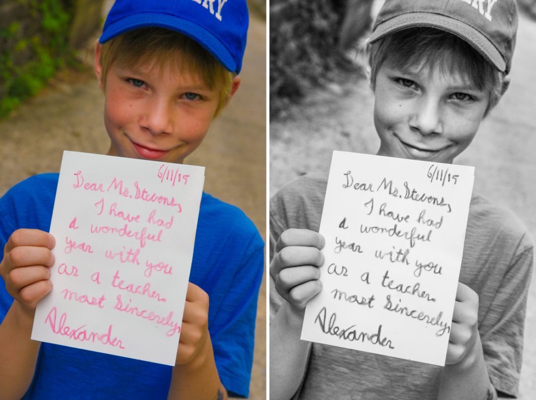
When I teach my photography classes students post their assignments into a gallery and I react to them with comments. Sometimes I point out that their color photograph may just be more powerful in black and white by producing a before and after for them and posting that in the gallery for them to evaluate. Very rarely – almost never – does anyone ever say that they like the color version better. Obviously, I’m choosing photographs that I think will benefit from black and white, but they often say something like “I love the black and white. It never would have dawned on me to change it.” ![]()
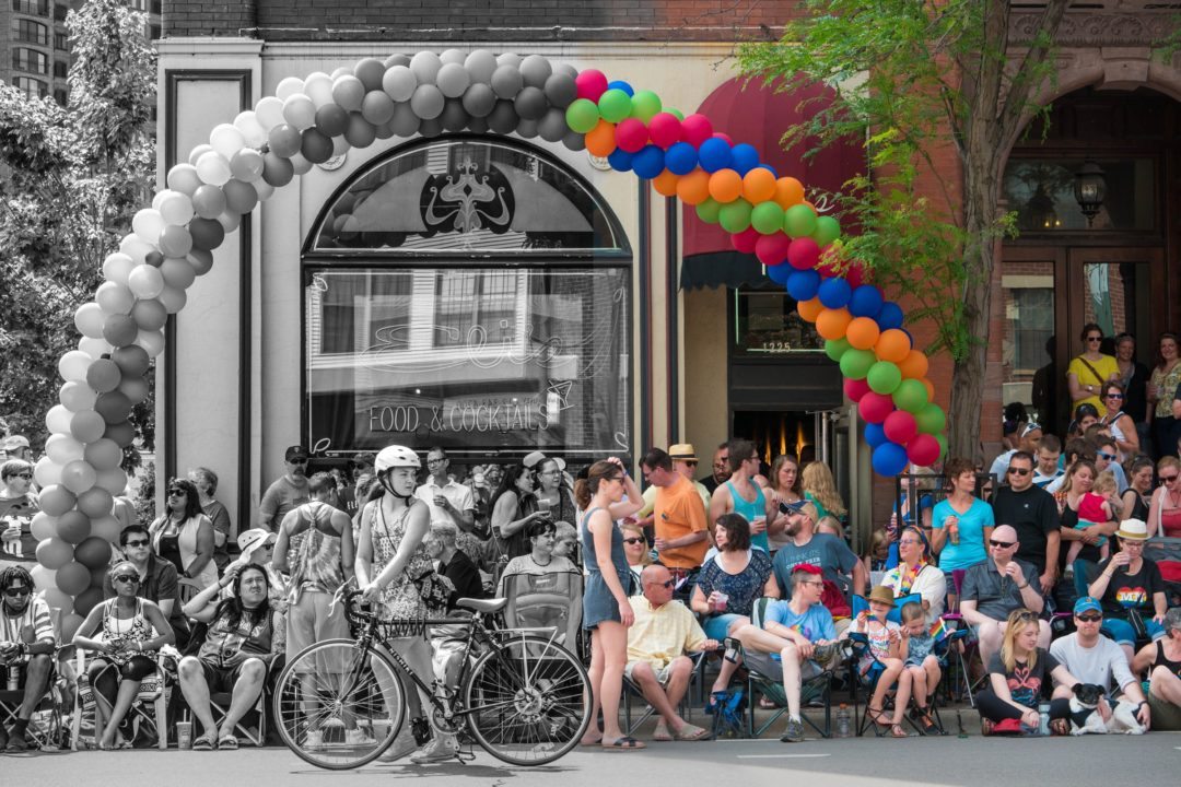
Just because there’s lots of luscious color in a photograph doesn’t mean it’s supporting the cause. Is the color in this case a help or a distraction?
![]()
It’s true that occasionally National Geographic, for example, publishes a major story in black and white, but their marketing and poll numbers indicate that fewer viewers look at those photographs and many of them would rather see the pictures in color. (That does not stop the black and white loving editors of the magazine from plowing ahead, however; they need to get it out of their system. They, like me, were raised on black and white.) Sales of newsstand magazines that normally run color covers take a dip when the editors decide to get a little artsy and use a black and white photo on the cover.
There’s really no doubt that color grabs the eye faster than black and white. Most graphic designers would tell you that using a black and white photograph in an otherwise color photo layout is like wearing khaki pants and a blue blazer to the prom. It’s difficult for black and white to compete with color in the same arena; they do different things. (The same can be said of fine French cuisine and Popcicles.) When you are using black and white photographs you need to consider the context—the arena.
If you really want to show your viewers what something looks like than color is probably the way to go. On a practical level, color communicates more and better. There’s no getting around it. It you want to show your readers how something feels, however, then black and white just may be the way to go.
So where does this leave you? Am I suggesting that you convert all your pictures to black and white? Certainly not. But I also think there is a overriding question that needs to be asked of every color photograph.
Is the color in this photograph helping or distracting? In my next blog I will address this eternal question.


If I think of photography as “art” or “making a statement” or “evoking a feeling” (specifically a dramatic or sad feeling, not so much a happy or fun feeling) then I’m quite comfortable with black & white photos. But if I think of photography as preserving a moment in time, a memory, a depiction of what was a reality, then color is my definite preference. In general I have great respect for editing software that can correct for my mistakes such that the end photo represents the reality of the scene at the time I snapped it. But I balk at using such software to change what really was into something it wasn’t – such as darkening the sky to appear threatening when it was really a blue sky kind of day. That doesn’t impress me with the photographer’s skills, although it may create a photo that impresses – it’s CGI. As a digital scrapbooker I will convert a color photo to b & w on occasion. Sometimes to blend better with other photos with non-complementary colors or because the original photo was not quite perfect and difficult to correct with software editing. But for the most part, my photos are intended to represent what was real in my life and I’m not going for the “art” of photography in my scrapbooks.
Thanks, Nick, for your take on “black and white” versus color. As you say, there are places for both b&w and color photos. Although I have, in the past, used black and white on some photos, mostly to hide a “bad” color photo, I will definitely be thinking more about trying b&w on more of my photos. I like the last question you posed…”Is the color in this photograph helping or distracting?”
Prior to the time I was introduced to you, your photography work, and your classes, I would always preserve the color in my photographs. I had a hard time understanding why someone would prefer black and white when colors are so rich and beautiful. Now, however, I am learning to appreciate B/W more.
I have recently found it helpful to convert photos to B/W when there are too many colorful competing patterns in the photo (as in groups of people wearing stripes, plaids, etc.) or when I take photos for a group that meets in a room with an awful wall color. I appreciate the thoughts in your blog about B/W conveying the subject’s emotion, and I can see that clearly in the B/W of Alexander and the note to his teacher. I’m going to commit to more B/W in the future thanks for the nudge.
When I see your pictures side by side. I see a big difference. Color pictures your eyes focus more on the colors than the picture itself. When I look at the black and white I see the faces, the lettering, and the expression on the face/faces. It’s like you see the drama, the sadness, happiness, more on the faces, and you don’t have to focus on the colors on the picture.
I just finished Nick’s “Going Manual” course, and at first I wasn’t sure I liked his “after” black and whites, but it wasn’t long before I was one of those saying “I love the black and white”. Before the course, I never converted any of my photos to black and white, or at least the few I tried I put back into colour.
During the course with Nick’s feedback on our photos and exposure to many black and white photos, I have developed a new appreciation for black and white (I also found the “convert to black and white” button on my editing program, which helped).
In particular, what I noticed was that sometimes colour gets in the way of the communication. As Nick says above, it can be distracting. Yes, it grabs you quickly as in the two photos of Alexander above, but if you look at the black and white version, Alexander’s eyes are arresting and much more compelling than in the colour version.
Nick’s Ansel Adams illustration struck me forcefully, and I now try out and keep many photos in black and white.
Agree, when shooting B/W film I concentrated on telling the story. With color you have to worry about color temperature, will the color dominate…Steve McCurry’s photos are great in color but also strong if viewed as B/W. How can this be? I wonder if some would even have more impact in B/W???
I have always been a huge fan of B&W, but my B&W images never “popped” they way others images seem to. Taking one of Nick’s tips of increasing contrast when converting images to B&W made a huge difference! With the strong yellow cast I get when shooting in florescent lighting, converting to B&W has saved many photographs for me! (I always forget to change my white balance settings…need to retake the GM course!) I think for the most part B&W images seem more timeless. I’m right there with you Nick! Dinosaurs unite!
Both are wonderful in their own way, but black and white brings out the emotion of the photo. I have some black and white photos from my wedding in 1993 that were taken by a friend and when I look at them I’m transported right back into that moment, experiencing the joy of the moment. And if you’re old because you love it, then I’m right there beside you! Black and white is timeless and elegant and true art.
I love the look of black & white photos. I can feel or see exactly what story is trying to be told or emotion felt in the black & white. I think sometimes and in certain color photos that the color is dictacting what you should be seeing or feeling. I have always loved looking back at all my parents photos growing up and they are all black and white. The photos of my kids that I cherish most and get the most emotion from are the ones in black and white. maybe I’m showing my age too 😉
I love colour! When I first started taking pictures colour was not available and when it first became available it was prohibitively expensive and not the quality it is today. So I associate B&W with old technology and don’t tend to choose to use it. That said I have seen a few pictures that are better in B&W — they tend to be portraits where colour may distract from the person in the photo. However, since I am not normally a people photographer I still prefer colour. Maybe I am the one showing my age since I remember the days when good colour was not available and now I rejoice in the beautiful colours that I can capture with my camera.
I never really thought much about the difference before. Of course, I take pictures in color! On rare occasions, I did convert to b & w, and really loved the photos but again didn’t give a lot of thought as to why. But now that I see the pictures side by side, I do see what Nick is talking about. I see that the color in the picture of Alexander is distracting and I agree with Lisa that you SEE Alexander’s face in the b & w…I think I will try converting more pics to b & w and then make the decision of which is better. Thanks for your insight Nick!
I’m definitely on the colour side. I’ve never liked b&w and even after taking a couple of your courses, I’m still not a fan. Very, very rarely will I prefer b&w, but probably 99% of the time, I like colour better. Just looking at your picture of Alexander, to me the b&w makes his skin look older and rougher, while the colour lets you see the beautiful rosy glow in his cheeks. That difference is the first thing that stood out to me. Yeah, the printing colour is a little distracting, but it’s not the first thing I notice, since humans are very drawn to faces.
I have always be in love with black and white photography. It has a special feel that makes you look just a bit closer to see the detail, and what is the story behind it.