I could probably do weeks of photo tips about what to wear in photos—and I just may do some of that later. But the quick answer I always give when people ask what they should wear in the picture is this:
- Solids are good / bright colors are usually good
- No prints
- No plaids
- No printed words
- No fancy collars
- No solid whites
- Minimal solid blacks
And no bell bottoms (I just say that to see in they’re listening)
Most of these rules apply to color and black and white, by the way.
Santa hats are OK for the Christmas card, I suppose. Seasonal sweaters make everything look, well, seasonal. I’m not crazy about the entire family wearing the official family sweater of the year but that’s a matter of personal taste. You would think you don’t have to tell people with reasonably good taste that their kids shouldn’t wear tie-dye or camouflage in the family Christmas photo but I’ve had to reject both.
If I’m going to someone’s house to take a family portrait it’s not unusual for me to end up at their closet as they show me the possibilities. I think that cuts through a lot of back and forth and trying on outfits that aren’t quite right.
If you just keep in mind that it’s all about people and not clothes then you should be in the ballpark. Let the faces carry the heavy load.
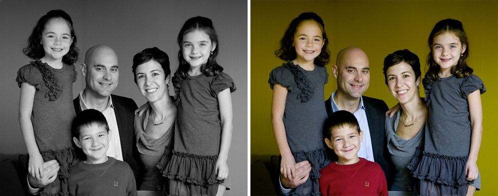
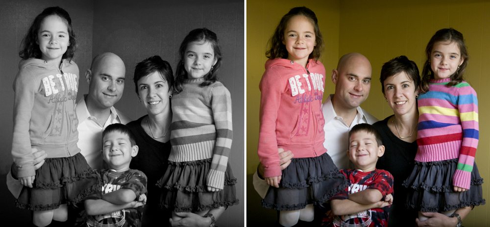
The background wall color isn’t great which is why I intended the finished product to be in black and white, but I wanted you to be able to compare the simpler clothes to the version above. The pop of red of Brody’s sweater really helps in the color version. If only one person wears something bright it’s very helpful.